
MOODBOARD
I was inspired by the heart of Greek culture — those beautiful sculptures, the incredible sunsets, and the endless blue of the Aegean Sea. The mood board for Galini Suites captures the colors and textures that truly bring Santorini to life, from the ocean’s deep blue to the sandy tones of the island’s walls and the bursts of flowers everywhere you look. Each detail is a piece of Santorini’s spirit, and I wanted to bring that warmth, beauty, and calm into Galini Suites.

SKETCHES
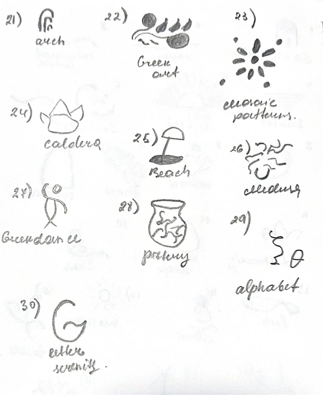
I started the creative process by sketching out the key elements that really capture the essence of Santorini. Knowing my target audience, I dove into font options that felt serene and elegant, which helped shape the 'Galini' logo—symbolizing calmness and the ocean. I kept asking myself, 'What does this hotel stand for? Why do people choose it?' The answers were clear: the incredible views, unforgettable sunsets over the ocean, and the high level of customer care that truly makes guests feel valued.LOGO OPTIONS
I introduced three different logo options with mockups to illustrate how they would look in real-life settings. The first is a bold logo, designed to convey strength and modernity. The second is a Type Letter Logo, inspired by geometric Cycladic shapes, offering a clean and timeless feel. The third is a Serenity Sunset Line logo, created to evoke the calmness and warmth of a Mediterranean sunset.


COLOR PALETTE & TYPOGRAPHY
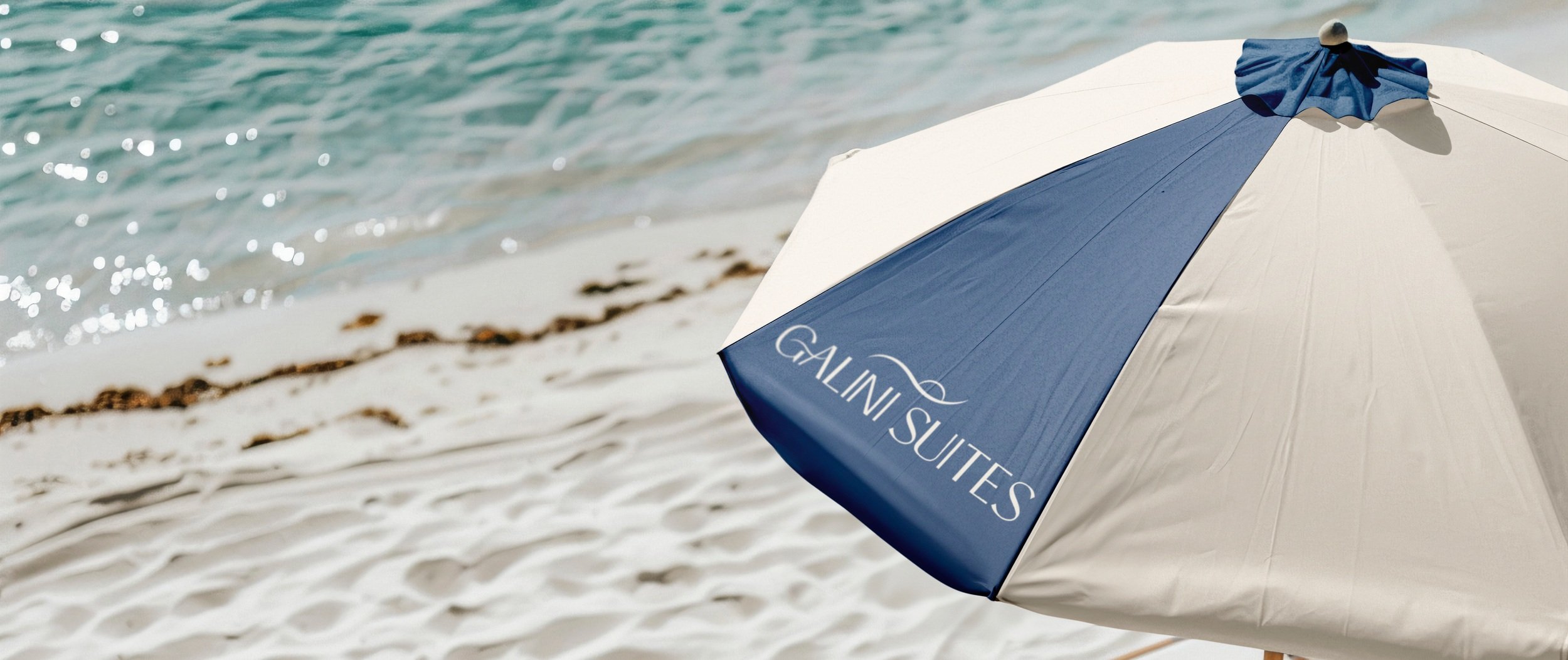
The color palette for the Galini Suites project includes Aesgan Sea Blue, which represents the calm of the sea, and the soft, warm tones of Sky Sun, giving a peaceful and relaxing feel to the design.